For Graphic Project class
The class had to develop a pattern and choose where to apply it.
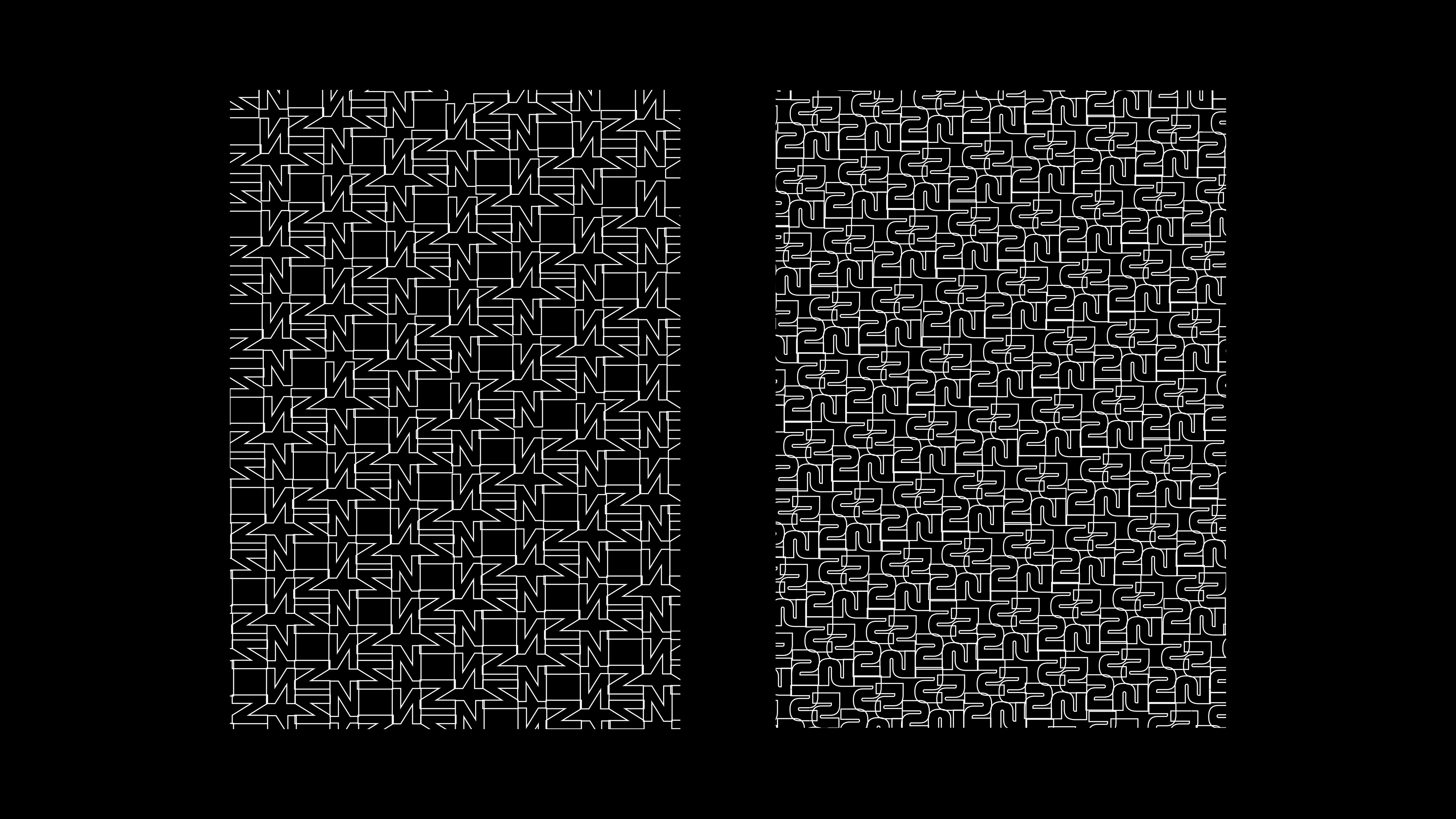
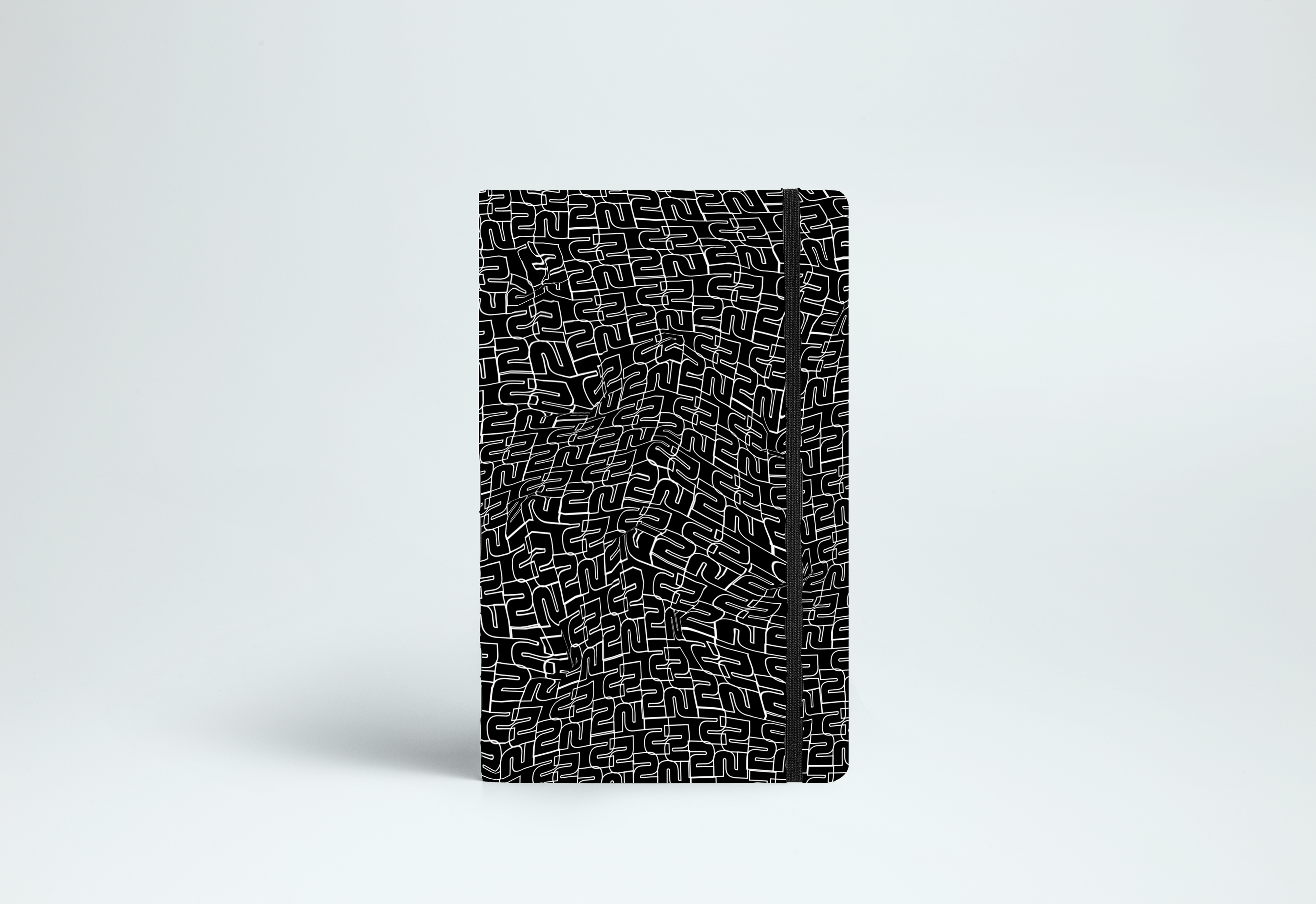
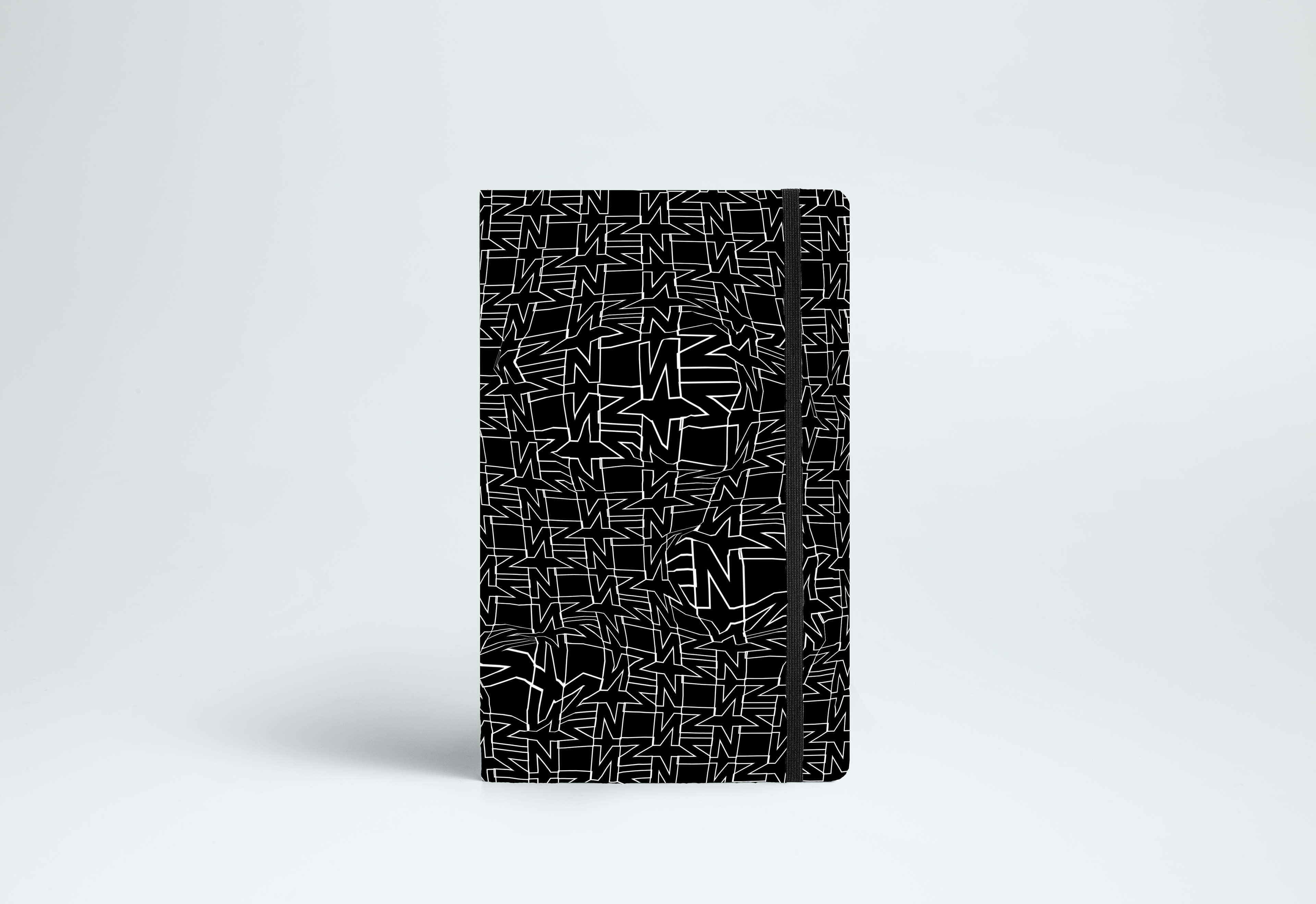
My partner and I chose to develop a pattern for stationary items using only numbers and letters in different rotations and positions. Our goal was to explore typography beyond its utility in communication, highlighting its aesthetic value in an universal, genderless, and ageless project.
In order to create an intriguing, eye-catching and minimal-chic graphic, we chose to use only black and white lines and added distortion.
Inspired by Cyber, Op Art and Bauhaus.